Sometimes stock prices follow a mysterious trend line (or channel). The trend lines provide ‘support’ or ‘resistance’ in stock price movement. Some common patterns can also be derived from the trend lines. However, drawing trend lines can be subjective. It is also hard to draw precise lines, and it takes patience. Speaking of preciseness, nothing can be more accurate than computer calculation. However, it still depends on how you want the lines drawn.
Here is my attempt to draw simple trend lines.
import yfinance as yf
import numpy as np
import pandas as pd
import matplotlib.pyplot as plt
import seaborn as sb
from datetime import datetime as dt
from datetime import timedelta
import math
from itertools import combinations
from scipy.stats import linregress as lrDownload Yahoo Finace Data
Downloads from Yahoo Finance library is a multi-level-index dataframe. It contains HLOC of stock prices as well as adjusted close (Adj Close). For example, NVDA, after 6/7/2024, will have very different Adj Close because of the stock split and dividend. For simplicity, I use the daily closing price (Close) only. Since I downloaded 5 stocks at once, after the 1st-level index Close, there are the stock-level index. To get the column of a stock, I use daily_close[ticker].
To fill the non-trading days, I use pandas linear interpolation.
end_time = dt.now()
start_time = dt(2023,1,1)
tickers = 'spy msft meta amd nvda'
history = yf.download(tickers, start = start_time, end = end_time)
ticker = 'SPY'
daily_close = history['Close']
ticker_daily = daily_close[ticker]
[*********************100%%**********************] 5 of 5 completed
Fill non-business days with linear interpolation
df = ticker_daily
df = df.resample('D').interpolate('linear')
To avoid the complication of using DatetimeIndex as the x-axis for plotting, I add a dummy x-axis integer numpy array to a dataframe column alt x. I then use the matplotlib function twiny() to make the ‘alternative’ x-axis. the x-axis ticks will show just under the title of the plot. However, I hide the ticks to avoid confusion.
Alternative x-axis making drawing trend lines easier
df = df.to_frame()
df['alt x'] = np.arange(len(df)) + 1
To draw a trend line, we just need 2 points. The upper trend line obviously is a line that connects highest points on the price chart. However, the 2 highest points can be adjacent to each other. That obviously is not what we want. So I divide the time series into groups. For example, we have 506 data points (from 1/1/2023 to 5/22/2024). If I divide the data into 10 groups, each group will have 50 points. I made it 51 points, which is about 2 months. This is subjective. of all the popular stocks I’ve looked at, only TSLA has a distinctive cyclical pattern. Three months is an earning circle, but I don’t see any obvious pattern for that time interval. This also obviously depends on your interest (trading frequency).
Coding-wise, in each group, I sort the price to get the highest price of each group. I save the local maxima in a new dataframe high_points and likewise low_points. Each of these dataframes contain just 10 rows.
Divide time series into groups, so we don’t draw trend lines using adjacent points
# divide df into n groups
num_groups = 2.
num_points = int(math.ceil(len(df)/num_groups))
group_number = np.arange(int(num_groups))
new_df = pd.DataFrame()
# group local maxima and minima
high_points = pd.DataFrame()
low_points = pd.DataFrame()

for group_number in range(int(num_groups)):
    # last group might have fewer data points
    end = min((group_number+1)*num_points, len(df))
    start = group_number * num_points
    # sort prices and find the max and min for each group, concat and build a new dataframe
    temp = df.iloc[start:end].sort_values(by = ticker, ascending=False)
    new_df = pd.concat([new_df, temp])
    high_points = pd.concat([high_points, new_df.iloc[start:start+1]])
    low_points = pd.concat([low_points, new_df.iloc[end-1:]])
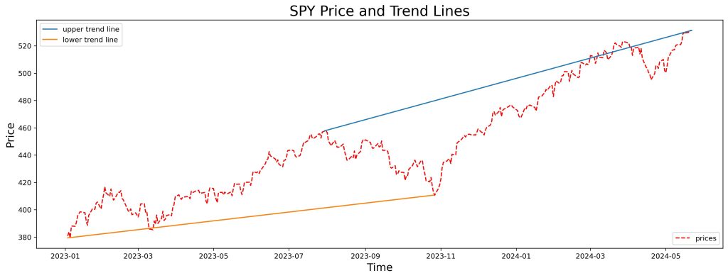
I find the 2 highest/lowest points of the dataframes. Connect them with straight lines. This results in a very local trend line since we have been in a strong uptrend. So the upper trend line shows up between the recent highs, while the lower trend line is way back in the beginning of the chart. I played with the number of groups to come up with the chart-wise trend lines as shown below. I eventually used just 2 groups.
Find the highest pair and lowest pair of points, among the group maxima and minima
high_pair = high_points.sort_values(by = ticker, ascending=False).iloc[0:2]
low_pair = low_points.sort_values(by = ticker, ascending=True).iloc[0:2]
fig = plt.figure(figsize=(15,5))
ax1 = fig.add_axes([0.1,0.1,0.9,0.9])
ax2 = ax1.twiny()
ax1.plot(df.index, df[ticker], label = 'prices', ls='--', c='r')
# hide alt-x ticks in the plot
ax2.set_xticks([])
ax2.plot(high_pair['alt x'], high_pair[ticker], label = 'upper trend line')
ax2.plot(low_pair['alt x'], low_pair[ticker], label = 'lower trend line')
ax1.set_title(f'{ticker} Price and Trend Lines', fontsize=20)
ax1.set_xlabel('Time', fontsize=15)
ax1.set_ylabel('Price', fontsize=15)
ax1.legend(loc=4)
ax2.legend()
fig.savefig('trendline-max-points.jpg', dpi=300, bbox_inches='tight')
A technical problem is that I use matplotlib to connect 2 points. So it only shows a line segment. I try a different approach to draw the lines below.
Approach 2: find slope and intercepts, from group max and min. I choose the lines with maximal slopes. Lines depend on how many groups the data is divided into.
Turn dataframe into tuples (alt x, stock
price)
hp_subset = high_points[['alt x', ticker]]
lp_subset = low_points[['alt x', ticker]]
hp_records = hp_subset.to_records(index=False)
lp_records = lp_subset.to_records(index=False)
Now I try to draw lines between any combinations of 2 points from the 10 points in the high_points dataframe. the number of combinations (‘n choose k’) is 45. I then use the scipy library’s linregress to find the the slope and intercept of the line connecting any given 2 points. I compare the slopes and choose the line with the maximum slope. I figure if the slope is smaller, the line will intersect with the price chart. That seems to defeat the meaning of trend lines.
Iterate through pair combinations to find maximum slope,
using linregress
def find_max_slope(records):
    max_slope = 0

    for combo in combinations(records, 2):
        point_1, point_2 =combo
        x, y = zip(point_1, point_2)
        slope, intercept, _, _, _ = lr(x, y)
        if slope < max_slope:
            pass
        else:
            max_slope = slope
            alpha = intercept
    return max_slope, alpha
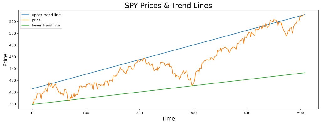
For plotting, I use np.linspace() to create the x-axis values. This way, given the slope and intercept, I can draw chart-wise lines. Again, I have to play with the number of groups and eventually I use only 2 groups. The result is shown below.
Draw lines across the chart, instead of just connecting 2 points
x = np.linspace(0,508,2)
slope, intercept = find_max_slope(hp_records)
plt.figure(figsize=(15,5))
plt.plot(x, slope * x + intercept, label = 'upper trend line')
plt.plot(df['alt x'], df[ticker], label='price')
slope, intercept = find_max_slope(lp_records)
plt.plot(x, slope * x + intercept, label= 'lower trend line')
plt.title(f'{ticker} Prices & Trend Lines', fontsize=20)
plt.xlabel('Time', fontsize=15)
plt.ylabel('Price', fontsize=15)
plt.legend()
plt.savefig('trendline-max-slope.jpg',dpi=300, bbox_inches='tight')
The upper trend line still intercepts with part of the price chart because even though I select the line with biggest slope, I only divide the data/time series into 2 groups. The maximum value of the 2nd group obviously is the most recent high.
Conclusion
I use 2 different approaches to draw trend lines of a stock price chart. I divide the chart into 2 groups and try to connect 2 maximum/minimum points. If I simply choose the highest or lowest 2 points, the trend line is ‘local’ or short-term trend. To get a ‘long-term’ trend, I either have to cut the number of group division, or iterate over all combinations of pair of points to compare slopes and intercepts of the ‘regression’ lines.
Again drawing trend lines is subjective. The results can be manipulated based on the time span desired.
